

he said he wanted it so i did. Now should we ban him?

|
|


he said he wanted it so i did. Now should we ban him?


i kinda like it like this
Banned.
lol
I honestly don't think it looks 'bad'.
But I honestly think the whole banner with the gauges up top, and the pillar gauges need to go. Way too generic and 'noobish'. Looks like this site was just now put together or something.
good point
yea, well i got to sleep. there is some images missing i will fix tomarrow

Sorry Scotty, we arent feeling the gauges on the side. We both liked the new green look with the gauges at the top when it came out and as JB mentioned in the suggestion thread that when the original year-old look was brought back that this was much better looking. Im not real crazy about how all of the forum topics are pushed over to the right side of the screen and it is dead spaces all the way down the left. I also am not too fond of the forum replies as everything appears very segregated this way and each responce has its own frame and looks like it eats up a lot more room, though easier to single out each post. I do like how the engine and trans area sub-sections were cleaned up and put together. I know of a few other forums that went down this road wanted a face lift and there were voting pages created with numorous options and then thoughts and votes were all made. I know it takes a lot of work to create all of this and the time involved and I have someone working with me currently on my site and he cant stress enough about ideas and creativity and also not being shy about what we dont like. There is no reason to put in the effort if it isnt pleasing in the end! If there is a way to have a page of links to forum layouts and backgrounds that you guys are working on that would be great! That way it is easier to do a side-by-side comparison instead of change the whole forum and try to remember the details of the last layout without being able to see it.... well for us anyways lol.

i came on saw it was different and tried to push the panic button jst to find out it didn't work...lol

i don't like the posts being the whole page.

not feeling them......

gots to go

We'll probably see how it goes over time.
The one problem I foresee with having a way for the members to select their own theme is that some issue pops up, something doesnt look right or work right but all the other themes do and so you are stuck trying to chase down something on one theme.
As well, with the A-Pillar gauges, the only place you see them is on the main forum index, as far as I know they dont show up inside any of the topics.
I will say this and its one thing I am adamant about, I do not like narrow pages as with the theme we had up yesterday. I would much rather prefer that the themes and the pages open up the whole width of the screen. Not only do I think it makes for harder reading as you have to scroll more, it also causes issues with some pictures that are posted, particularly if the image is wider than what the them or post area is and that makes things look horrible.
In the long run, we'll have to see how it plays out over time. How things work out and such. We definitely need the input, dont get me wrong about it. But personally my vote is to make the theme look like an automotive site because thats what it is, but that doesnt necessarily mean we dont have some room to adjust things a bit either.


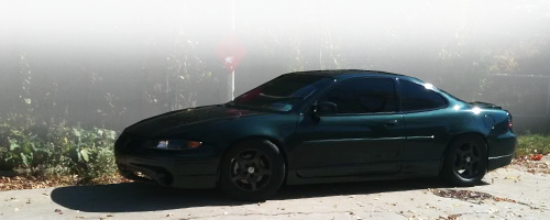
Acura-Legend.com :: Acura Legend Forum :: Acura RL Forum has two different themes. they have v1 and vibrant, you can select what you want. basically the layout is the same, but one is just plain black and white, and the other is black background with different colors and things. they are selectable at the bottom of the page... idk who set it up, but i may be able to find out and let you know... just a thought. because i have to say, i dont like the way the posts show up. and i think at the top there should be a pic of a grand prix like on the original one, or nobody will know what the forum is... they may think its like a racing forum. anyway just my .02
sample of the a-l.com site
v1
and vibrant


I got your back scotty!
LOL. You have a bright future here then.

I personally like the new layout. The only suggestion I have is to split the engines up a little bit like before. Anyways great site and thanks for all of your guys' hard work. This is by far the best grand prix site I have found.
| « Previous Thread | Next Thread » |
| Tags for this Thread |
| Bookmarks |
Bookmarks |


